Twitter just announced the global roll-out of design rework for its Android app. The new design follows Material Design principles outlined by Google in a constantly updated, "living document".
With the adoption of the Material Design language which has been around for almost two years now, Twitter joins the likes of Facebook Messenger, Imgur, Skype, and others who have also in the past rolled out updates based on the Material Design by Google. In fact, Google has borrowed the design concept to redesign some of its own apps like Google Analytics, Google Drive, Hangouts and YouTube.
Twitter now has a persistent top bar with tabs for the Twitter feed, notifications as well as direct messages. There is a persistent floating action button as well, to instantly send out a new tweet. This is similar to the ‘compose new email’ button in the Gmail app. A swipe to the right reveals a profile drawer with additional options, including highlights, lists and contacts.
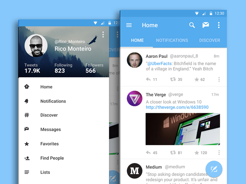
This replaces a dual navigation bar on top, one of which had the compose tweet and profile options, the other one had home, hashtags and replies. Scrolling to the top and pulling down reveals the Search icon now, which was previously persistently available on the top right. The new design gives a cleaner interface, and brings into focus all the most important actions, while hiding less frequently used buttons behind swipes.
The update is in the process of being rolled out globally.
A revamped look and feel for our @Android app, now rolling out globally! See what's new: https://t.co/MOaWKJgjqc pic.twitter.com/snL8pBLnDL— Twitter (@twitter) June 7, 2016
What do you think of the Material Design makeover? Do you like it, or does it fall flat? Let us know in the comments section below.
Follow Me on Twitter>>> @iamBhavish
And like us on Facebook>>> The Gud1

No comments:
Post a Comment