y Ellis Hamburger - theverge

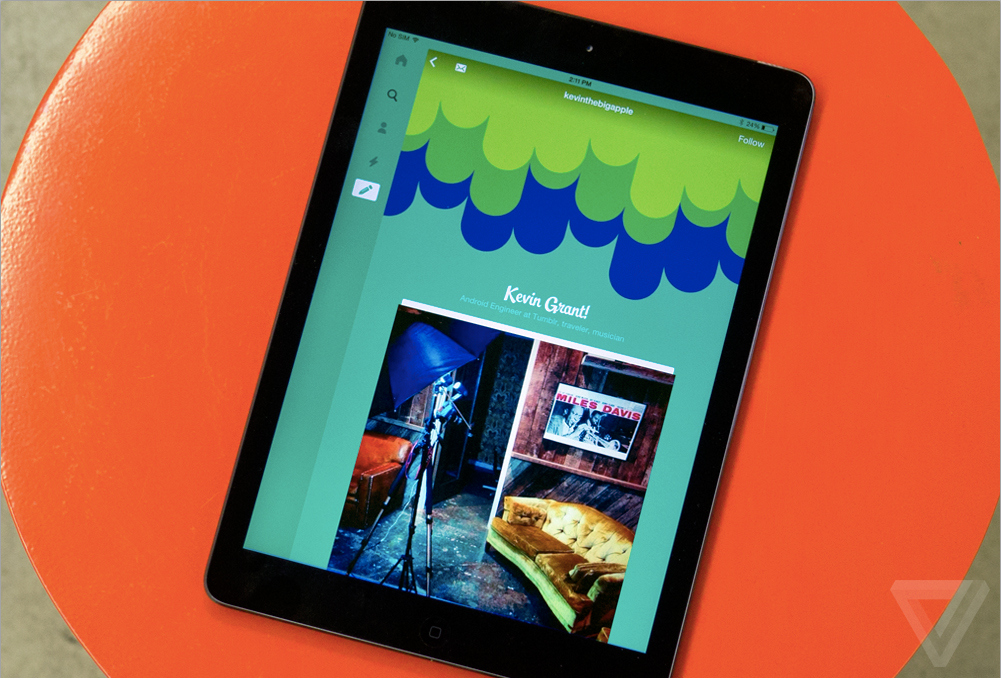

Tumblr founder David Karp thinks a lot about the web as it was 15 years ago. A web filled with blinking words, Shockwave Flash, and GeoCities pages packed to the brim with clip art. It was a weird, unstructured, seemingly limitless domain where, armed with a few HTML tips from a friend or message board, you could build your first home page and publish it to the world.
But then everything changed.
“In the early 2000s, [the web] started to take a pretty sharp turn towards vanilla, white profile pages,” says Karp. To him, Facebook’s stark white pages weren’t refreshing like they were to MySpace refugees — they were restrictive. “The draw to the internet for me was this idea that it was a space where you could really create an expression of yourself — an identity that you’re really, truly proud of.” Karp saw sites like LiveJournal, Blogger, and GeoCities disappearing by the day. “Social networking” sites, where every username was printed in the exact same font, were winning out.
Fast-forward to today, and Karp has turned accidentally hypocritical. Inside Tumblr’s mobile app, 180 million blogs are all colored the exact same shade of blue, with hardly any distinction between them. Tumblr was always about more than the content filling up your blog — it was about creating a digital room of your own, decked out with posters of all your favorite things. Tumblr became famous for making blogs on the web customizable, and now it’s finally catching up to a world gone mobile. It’s launching its new mobile app for iOS and Android, which bundles in a variety of new editing tools to customize your blog on your smartphone for the first time.
Tumblr’s new tools aren’t revolutionary, but in a world filled with social networking sites that increasingly force their users into tiny white boxes, they recall a charming, messier age when it was easy to express yourself online using any mode you chose. It’s an age worth revisiting, I think; interfaces didn’t always make sense but somehow felt more personal. My DeadAIM messaging app, for example, was wallpapered with an image of Morpheus from The Matrix, but I wouldn’t have it any other way. My friends hated my orange Comic Sans IM font, but I wasn’t going to change. These days I’ve come to assume that cleaner, more minimal designs are better, but Karp hopes to convince me otherwise.

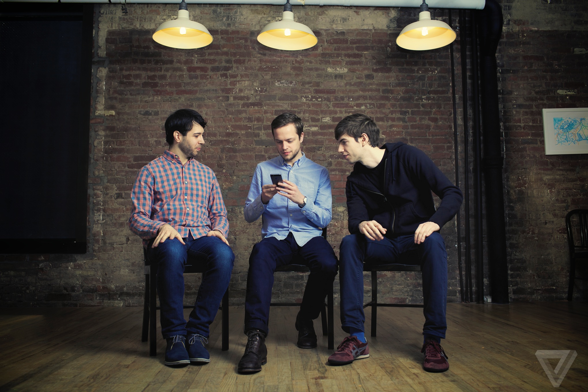
Tumblr's lead iOS developer Bryan Irace, creative director Peter Vidani, and founder / CEO David Karp
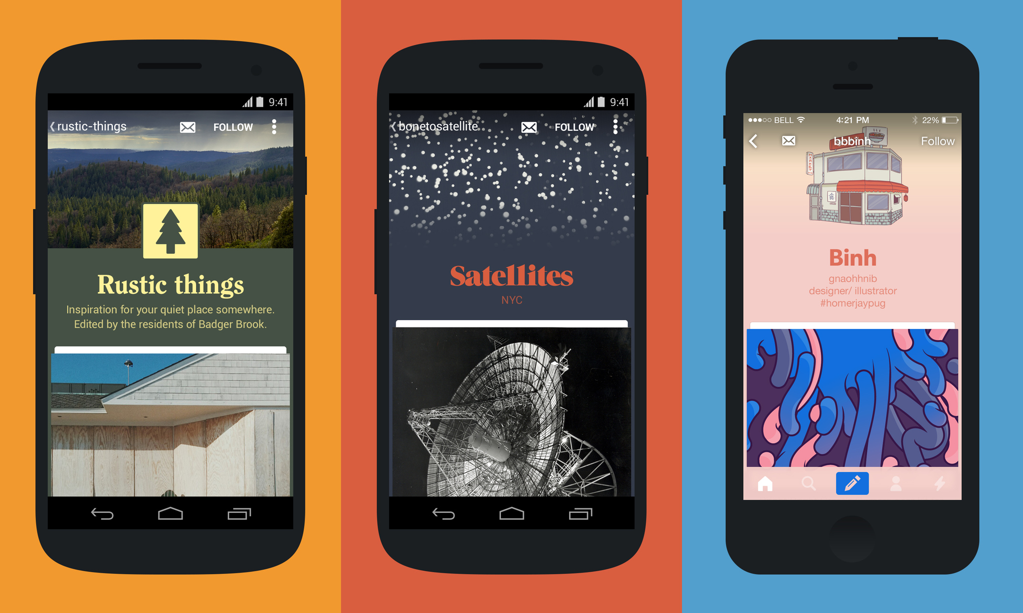
Karp created Tumblr back in 2007 to give people a place where they could be themselves, a community space that rejected sites like Facebook and Flickr — giant "directories" of profiles, as Karp calls them. Tumblr’s network of blogs today run the gamut from clip-arty pages from the 2000s to the minimal, Medium-esque stylings of 2013. There are "cabin porn" blogs, cyberpunk blogs, and personal blogs of all shapes and sizes. "On Tumblr, there aren’t just content trends — there are theme trends," says creative director Peter Vidani.
Tumblr users spend an average of 16 minutes on the site each time they log on, more than any other site
Users spend an average of 16 minutes on the site each time they log on, Tumblr says (citing ComScore), which is more than any other site on the web. Tumblr’s mobile usage is growing 124 percent year over year, and it now encompasses more than 50 percent of the site’s overall engagement — for Karp and his team, it was finally time to build blog customization tools for mobile.


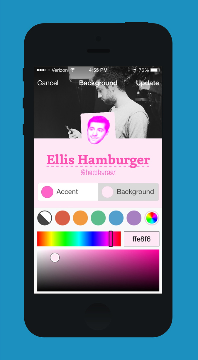
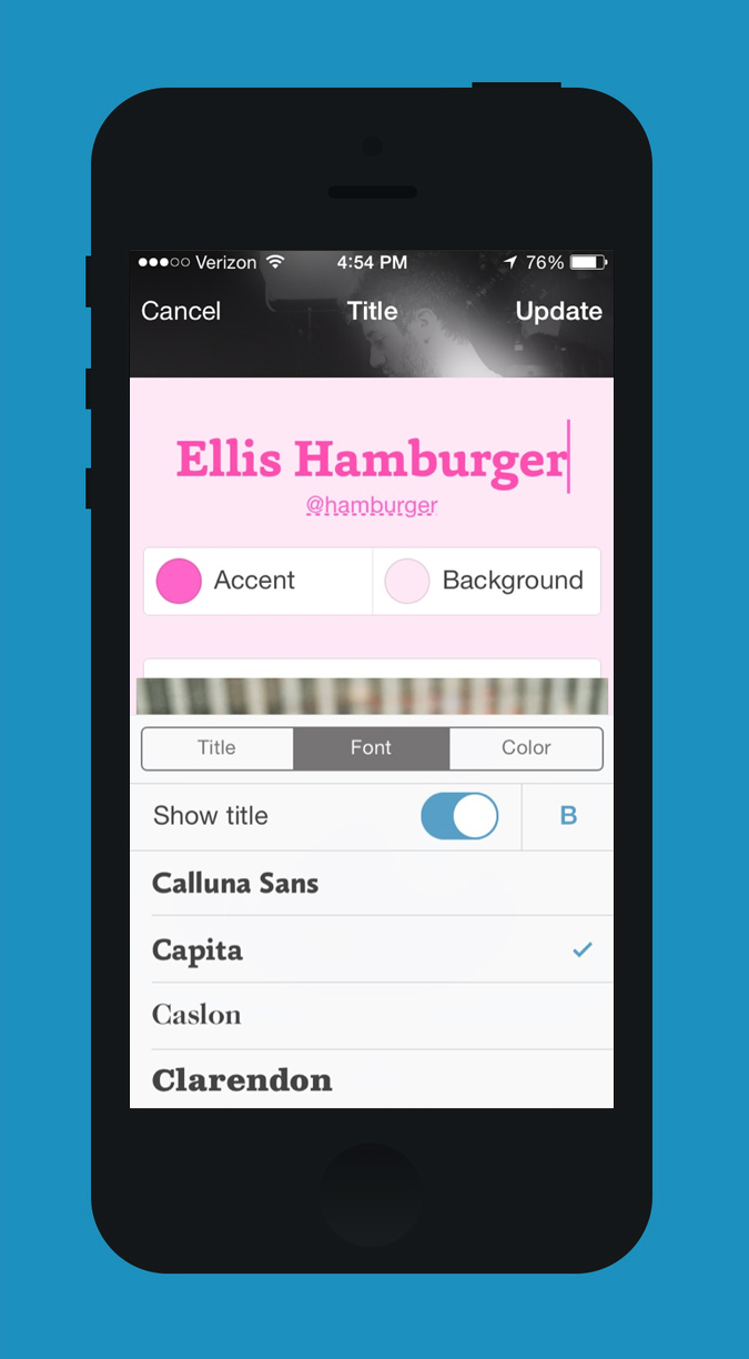
The new Tumblr app is built around a new feature called Appearance. By tapping a small profile icon next to your blog name inside the app, you can customize your blog just like you can on the web. You can choose a header photo, add a circle or square avatar, and choose among 33 fonts for your title and description. You can pick from a library of colors to dress up your title, description, background, and links, or plug in a specific color hex code like #FA4B2A. If you’d like, you can even remove your avatar, title, header, or description entirely.
Appearance is a slick WYSIWYG interface for customizing your blog, but what’s more interesting is what it means for "profiles" as they exist today on mobile. In today’s "content is king" era, most Silicon Valley entrepreneurs seem to agree that you are the sum of all the photos you’ve shared — not the font and wallpaper you’ve chosen for your blog. But not Karp.
"Now, it’s like your Instagram profile looks exactly, pixel-for-pixel, like everybody’s Instagram profile"
"Now, it’s like your Instagram profile looks exactly, pixel-for-pixel, like everybody’s Instagram profile," he laments. Karp is the first to admit that Tumblr isn’t exactly like Facebook and Instagram, but his vision for how digital identity should work can be applied more broadly. He seems to believe that our online profiles should change with us, and not just as the result of Facebook’s latest Timeline profile update. "It’s really tempting when you have hundreds of millions of [users] to say, ‘We need them to fall into these categories and we need them to fill out this form,’" says Vidani. "What we’ve done from the beginning is keep a pretty simple philosophy, that Tumblr is this place where you can come and we have no right to say who you are or what you should look like." But the company’s latest update goes further than how your blog looks.
Picking an accent color also changes the interface surrounding your blog for anyone who visits it. When I tapped Save after editing my blog’s appearance, the app’s Compose button turned pink and its navigation bar turned white to match my chosen Accent Color and background. The effect is particularly stark on iPad, where tapping into a blog dresses up the entire app in a new color. "There are 3.3 billion combinations," says Vidani, "[but] the biggest part of this is that we’re using it everywhere. This is going to be you." The company says 80 percent of active Tumblr users have customized their blog in one way or another.
Tumblr’s vision for social profiles stands largely at odds with the design philosophies of many tech startups, which create products and profiles that look the same to every user on every platform. Their interfaces are designed to be highly accessible and legible over all else, but Tumblr thinks there’s more room for personalization than you might think. "People confuse consistency with customization," says Derek Gottfrid, Tumblr’s vice president of product. Karp is more precise with the finger-pointing. "I think that right now, the Valley is very tuned for communication, social, and very utilitarian tools, and I think a lot of that is built around their ‘engineers will show us the way’ mindset," he says, "where something we’ve always tried to instill here, and always tried to hire for, is that the creators are going to show us the way. We’re here to empower them."

There seems to be one key question at the center of Karp’s argument: should the creators of modern publishing tools let their users create ugly, unattractive blogs and profiles? There’s no doubt that many of Tumblr’s 83.1 billion posts are hard to read, or make your cursor spit out sparkles and rainbows like it’s 1999, but at least these pages appear as their creators intended. Posts on Medium, on the other hand, are near-objectively beautiful and legible, but do they not tease a world where every book is bound in the same leather, and printed on the same paper with the same margins and typefaces? Perhaps sites like Medium provide a non-chaotic vision of the internet, one that has finally settled down to embrace real-world conventions that actually work. Or perhaps we’re ready to lose the training wheels these sites have imposed.
"People confuse consistency with customization"
MySpace didn’t go under just because of its messy, chaotic profiles. Facebook offered search that worked, a safe haven from spammy wall posts, and an ingenious "news feed" that alleviated you from visiting every friend’s profile individually to see what they were up to. Nearly 10 years after MySpace’s demise, profiles are still held dear by Tumblr, but not just because they’re customizable. "There’s not a one-to-one mapping between you and your blog on Tumblr, where there is that kind of mapping on other sites," says Bryan Irace, lead iOS developer at Tumblr. "You are not your blog." Irace says that he has created and at various points maintained nearly 20 blogs during his time on the site. Tumblr has afforded Irace, like many others, the ability to cultivate more than one identity, a rare characteristic among sites and apps that make you pick between using your real identity and going anonymous.
"I think people are proud of their Tumblr presence because it’s easy to make it an extension of your identity. It’s like a blank slate," says Jacob Bijani, one of Tumblr’s first employees, who left the company a year ago. "The way your blog looks is just as important as the content you share on it. I think that kind of personalization just isn’t in Facebook or Instagram’s DNA the way it’s always been for Tumblr."

As I walked around Tumblr’s office, a common refrain bubbled to the surface of almost every conversation. "Did you know that every piece of art in this office was produced by an artist on Tumblr?" I was asked repeatedly. Tumblr seems determined to elevate itself above tech, above conventional definitions of what a microblogging website or social network should be. "When I’m on the West Coast having conversations with friends building stuff out there, what do they obsess with more than anything?" Karp asks. "It’s not art, it’s not media, it’s not creators. Frankly those are very alien words inside of Google or Facebook today."
To Karp, Tumblr is one of the only places where creators can truly be free to look how they want and post what they want. "On Flickr you can post photos, and on YouTube you can post videos, but now the major services have started to say, ‘Post your square photos,’ or ‘Post your six-second videos, or ‘Post your 140 characters,’" says Karp. "As far as modes of self-expression, they’ve gotten more and more restricted … Do we want every visual thing we enjoy from here on out to be square?"
Karp’s vision for unbound creativity could be applied to just about any site, its goal being in trusting users to do the right thing and to present themselves however they choose to. But with trust can come confusion. Tumblr has historically struggled with discovery, and with explaining to new users why they might want to use it. Some recent reports say that growth on the site has stagnated, perhaps for this reason. Even still, Tumblr’s precedent for affording freedom to its users has paid back dividends with the amount of time people spend on the site when they do log on. These users are investing in creating a different kind of identity there where everyone doesn’t share the same font. Karp thinks that we’re not just the sum of the friends we’ve made, and of the pictures we’ve taken. We’re the frames we’ve chosen to put them in.

No comments:
Post a Comment